Workshops
- Dylan Osborne
- Feb 18, 2022
- 8 min read
18th February 2022
Paint | Acrylic, Oil and painting mediums
Week 1: Learning about layering techniques and extending our repertoire of painting methods, techniques and systems
Skin tones in pre-Renaissance paintings had green hues in them which is due to an underpainting technique called Verdaccio which uses green toned black and yellow ochre pigments
Fugitive colour: colour that doesn't last
We used black, yellow ochre, white and a shade of green to create colour with the yellow and green being the mid tone and the white and black to either darken or lighten.
These were used as palettes to use for reference when painting
When shading, shade from the outside in
To darken without using black use a complementary colour of the colour using (for me I used pthalo deep green to darken and add depth to a deep red as suggested by Craig)


Figure 1: Oil painting on Primed board


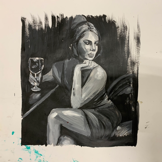
Figure 2 (left): Oil paintings on Primed Board. (Right) Acrylic on paper
I found learning about underpainting both useful and also difficult as I am very used to things looking perfect from start to finish. This method of painting is definitely more of a trust the process technique but it definitely has its benefits, like I found it easier to erase parts of the painting if they were wrong or not to proportion.
The image I ended up painting was not my own as I left my images at home and borrowed someone else's in the studio. However, I think this was good as it forced me to paint something completely different to what I would have chosen and I ultimately loved the outcome. It ended up looking very 'Noire' which I love the aesthetic of and did consider doing more research into this topic area but I ended up shifting my theme to Indian culture and my family history. Having said that I still think it was useful to try out something different which is why I'm still including this in my creative body of work.


Figure 3: Underpainting

Figure 4: Oil Paintings on Board
Figure 3 shows two oil paintings at different stages of completion. The blue painting is in the initial underpainting stage so the proportions are slightly off at its current stage but the orange painting is complete. I decided to try out different colour schemes throughout the painting workshop as I wanted to experiment with colour a lot in this project to see how colours differ from each other in consistency. I really liked the using the orange and and brown shades as they completed the woman skin tone in the image I used.
After doing these paintings I figured out my project them and so my focus shifted to India and so did my painting subjects. I still wanted to include these images as they show my experimentation and part of the process of getting to the point I am at.
Week 2: Learning about different painting mixers
Linseed is most commonly used to dilute but it has a very slow drying time
Turpentine, white spirit, Alkyd Flow Medium, and Zest it are alternative diluting methods
Oil paints get oilier after each layer which is how the paint sticks
3 Jars to filter out oil paint from dilution method and reuse most of it which saves resources and protecting the environment
Dammar Varnish (Made from tree sap). Dammar crystals in turpentine
6 parts turpentine : 1 part Dammar Varnish : 1 part refined linseed stand oil makes a paint medium that can be used for the second layer of painting and glazing
Beeswax pellets + Turpentine = Beeswax paste
Paraffin wax + turpentine = Paraffin wax paste
Both of the above are used to thicken and add texture to oil painting, especially for impasto painting.

Figure 4: Beeswax and Turpentine with oil paint on board


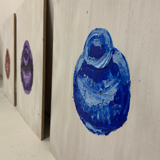
Figure 5
Figure 4 was painted with a mixture of Beeswax and Turpentine with oil paints. The object painted is called a Matka which is Hindi for an earthen pot. They are common pots all across India and come in different variations depending on which part of India you are in. They have been used since the ancient times and are usually a reddish earthy tone like the painting on the left.
Throughout my work I always keep everything very clean and a question I have been asked a few times is how can I loosen up my work? So this was a quick and rough attempt at doing something loose, or at least it is loose for me. I think that the blue and purple paintings were the most successful as I managed to achieve more depth in my painting compared to the brown pot. Overall I really did enjoy the process but I think if I was to use it in my other work I'd have to be very selective with where I used it as it could easily get messy. I could also work into the background with some thinner paints to add some more depth to the image.
Week 3: Learning how to mix our own paints and continuing experimenting
Mix powder pigment with linseed oil and gum arabica using a palette knife
By mixing your own paints you get to decide how thick it is
Mix with the muller (a tool used in conjunction with a slab to grind pigments) and do figures of 8
Do this 3 times over 15 minutes
It can feel rough at first but it gets easier
The figure of 8 ensures the pigment particles are dispersed evenly
If its unevenly dispersed you can end up with a dull paint
Don't use turpentine or anything like that at this stage. That is used when you apply it to the board/canvas
You can use a kettle and water to crush your own pigments from say, part of the ground
For cleaning baby wipes work or scrape of as much as possible and then use some oil to get it off. The same goes for brushes and the oil will keep them soft

Picture of Craigs paint after it had been made
Fabrics

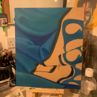


Figure 1: Oil painting of a Sari on board (Process)


Figure 2: Oil painting of a traditional Indian dress on board (Process)


Figure 3: Oil painting on board (Finished)
Throughout my work there is a lot of portraiture but in Indian culture fabric and clothing is a big part of their Identity too, which gave me the idea to paint fabric when I really don't want to paint people. I also painted these using techniques I learned from the paint workshop like underpainting and I used Zest it as my diluter which has worked really well. Figure 1 is a close up of a Sari I photographed on my friend and for the detailed embroidery I used rough brush strokes which at first I hated but as I started to fill in the areas it really started to work. I also used an unprimed board for the sari painting to see how the painting differed on each. I found that the board took longer to cover as the paint didn't seem to want to move as much on an unprimed surface.
Figure 2 is a close up of the fan on the skirt of a traditional Indian dance costume that I photographed on my friend. I ultimately found the board easier to paint with a primed surface but I still love both of the outcomes equally. I was really pleased with the shading I had achieved, specifically on the green part of the fan as I thought it looks very 3D which was what I was aiming for.
Print | Dry point Intaglio etching
For the print workshop we learnt about Dry point Intaglio etching
Intaglio - Below the surface
Oil based inks
Etching needle
Blue scrapers for covering the etching plate
Scrim (Cloth used to rub over the surface and also not very environmentally friendly)
Don't rub in straight lines, rub in circular motions
Tissue paper for more precise rubbing
Swan skin (the cloths that are on the printing press
White spirit for cleaning

Figure 1: Dry Point etching on paper
For my dry point etching I chose a difficult picture to etch of a Chinese women in traditional attire. Even though my project is based on India now, before I decided on India was just looking at culture in general which is why the woman is not Indian. However, this did remind me of a photography book I have called the Atlas of Beauty where the photographer travelled the world photographing women from different countries. She spent a lot of time in India and while in Northern India she photographed a woman who told her that a lot of people there are mistaken for being Chinese as their facial features are typically more Chinese looking. As a viewer this just reminds you that in one country the beauty varies greatly.
The process of dry point etching was quite strange as I wasn't sure how to achieve the tonal aspects of the face. I tried to treat the acrylic sheet as a piece of paper and use the etching needle as a pencil which actually turned out quite well. I decided to leave the beads with no detail as I thought it needed some simple elements.


Figure 2
Figure 2 shows what I believe to be my most successful prints as I think they are the cleanest. I also really like how the prints looked framed with the slightly patchy looking border around it. It was very unintentional but I think it added to the overall look and also reminded me of the Tanjore paintings that I have researched as they are often framed by curtains or archways embossed with jewellery.
The yellow print was the last one I did and surprisingly my least favourite as I didn't spend enough time rubbing certain areas and so the contrast of white and yellow isn't as strong. In saying that however, I do like the sun haze effect It created on the print. It reminds me of golden hour. Aside from this I didn't really run into any other issues. It was quite a smooth and enjoyable process and I am doing another dry point etching for my second print. I will be using one of the photos from my photoshoot I did of my friend in her traditional Indian dance costume. I may also experiment with some other colours and I might even work into the prints with some acrylic paint and pen. I also thought about whether I could print onto canvas for some mixed media pieces but Gillian said that the canvas would be too thick to go through the press.

Figure 3 Dry Point etching on paper
Figure 3 shows my second print which is an image I photographed of my friend in her traditional dance costume that she brought back with her from Hong Kong over Christmas, along with her traditional Sari and the matching garments. As I said I would after the previous print, I printed an Indian women to relate it to my project theme. I really loved the outcomes of this print and realised after I rearranged them that they are the colours of the Indian flag which was very unintentional but I thought was a nice little nod to India. I actually chose these colours because they reflected the colours of the dress she was wearing in the photo. I also decided to use the border around the image like I did in the previous print as I really liked the framed look. The only thing I wish I had done differently was possibly adding some ornate detail to make it look like an expensive frame that you usually see on paintings. I also decided to use different coloured inks to last time as I wanted to try out a wider variety of inks to see what Inks worked best. I found that even though the orange prints were my favourite outcomes, the ink was stiffer to mover and took longer to rub.


Figure 4
Figure 4 shows my favourite prints from this workshop of which I really love the orange one as it was the most successful in capturing my vision. The detail work looks nice and crisp and there is good depth in the face in contrast one of the green prints from Figure 3. I think aside from these dry point etchings, moving forward I would like to experiment with copper plate etching as Gillian suggested it to me as if you make a mistake you can add more highlights to it, whereas with the acrylic plate once the line is there you can't remove it. However that is something that I want to look at next unit as I want to focus more on my painting work for the rest of this unit.

Comments